
Playful packaging updates for hearty pet food.


Petco’s pet food brand, WholeHearted, wanted to refresh the treats line with three new forms. Previously, treats felt too similar to the food, seen here. They lacked the impact of photography and meaningful nutritional benefits, while small windows made it difficult to see the treats.

To capture the excitement & variety of treating, I went graphic.
Treats now burst in space, rotating around so you can see all texture from various angles, under a bold product name banner. Benefits & flavor move to the bottom of the bag, grounding these goodies with real claims.

Treat bursts are unique to each form, while color and ingredient confetti help define flavor.
The rest of the dog treats were later updated to match:


Cat treats featured even more variety in forms; bites, purées, and whole filets couldn’t be treated exactly the same.
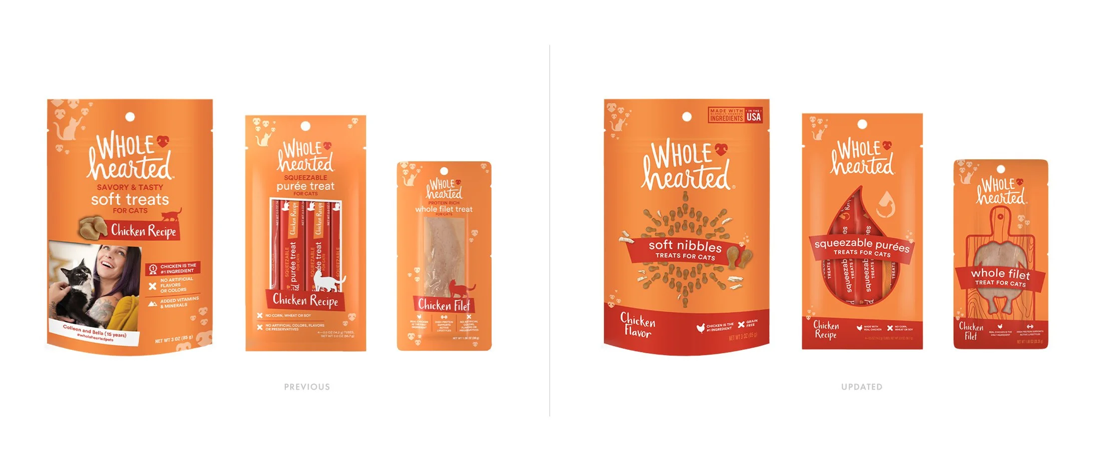


For filets and purées, the windows on pack now serve more of a purpose - defining protein or texture - while feeling more playful and eye-catching.

Frozen yogurt treat cups for dogs

Bakery treats

Freeze-Dried treats
Food concepts

For Active Performance dog food, I was asked to create a look that felt immediately, drastically different.
By reversing the design out of black and playing with angled type and stripes, customers can pick up on the sportier cues without having to get into the details of its protein:fat ratio.
For WholeHearted Plus, I was asked to build on the existing hierarchy of the With Grains line. By disrupting the layout with the equation banner front and center, customers get an immediate answer for what “plus” includes.


Puppy food shipper concept